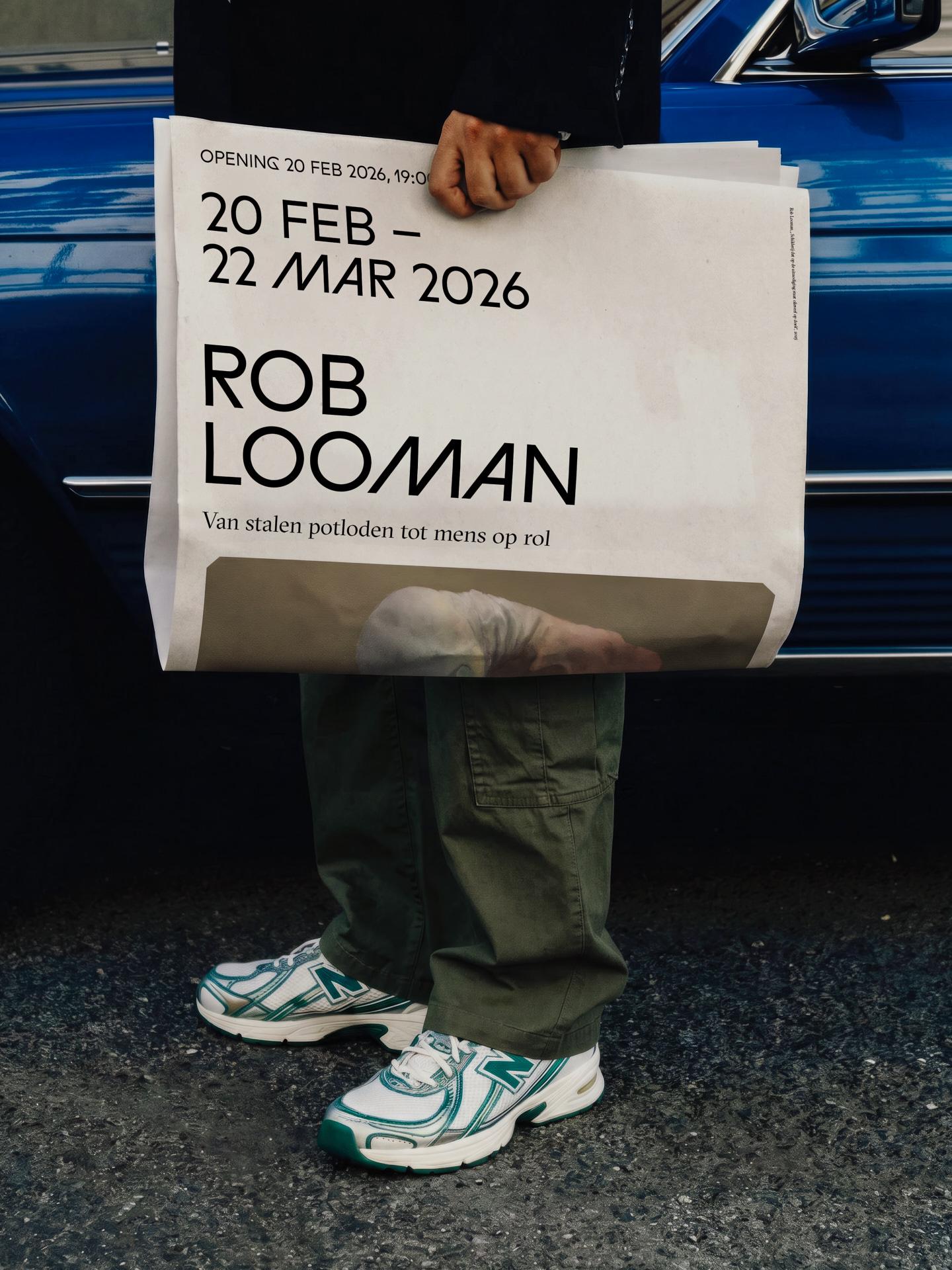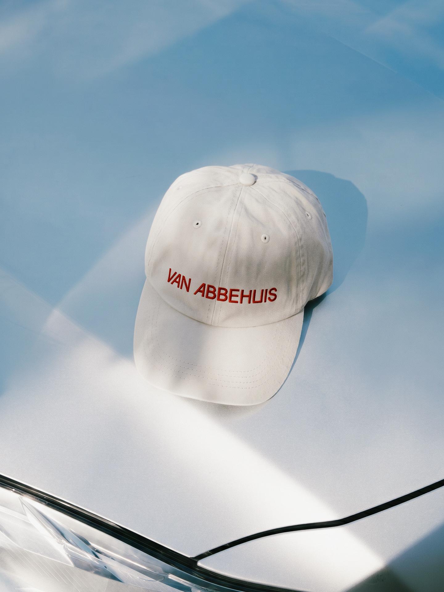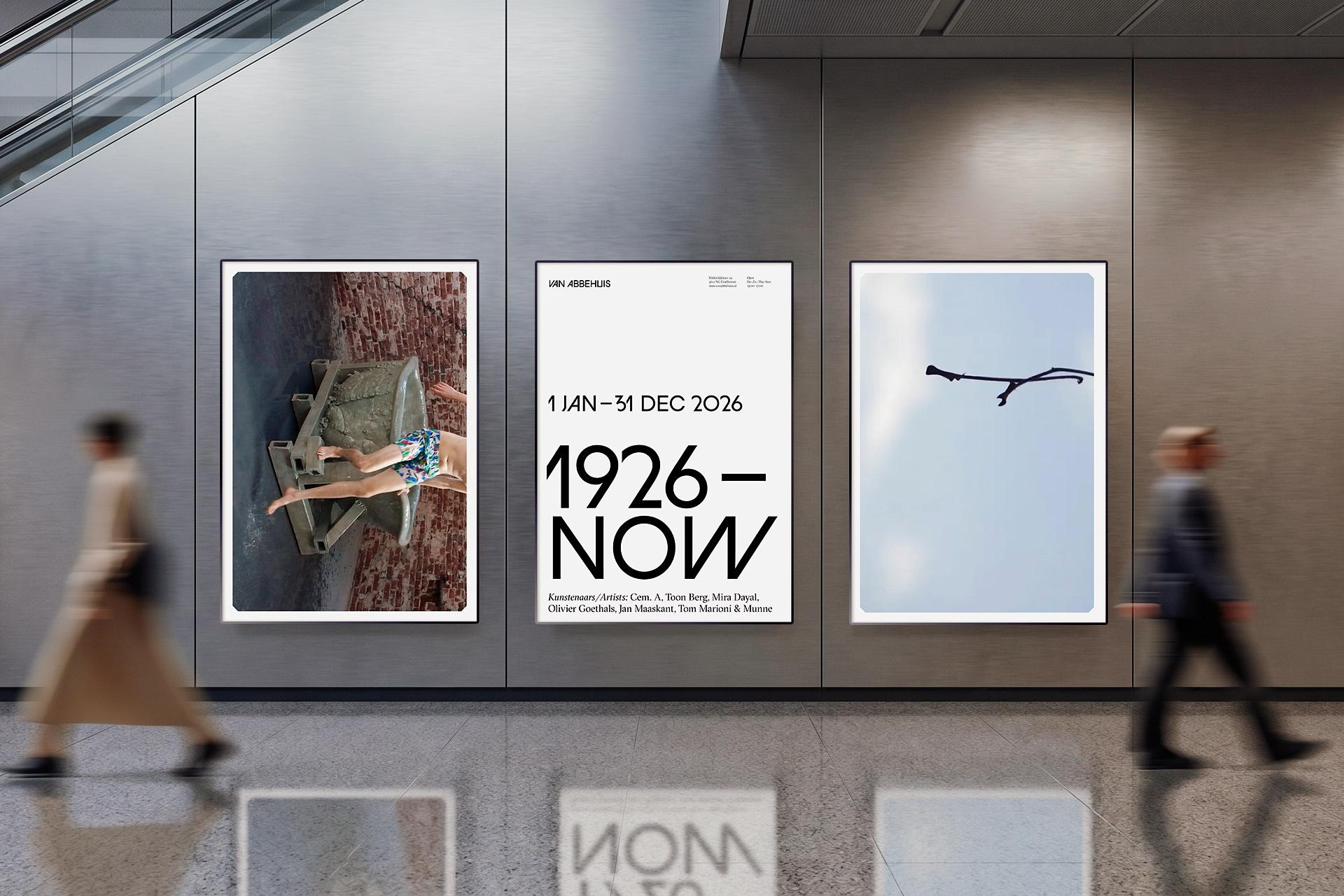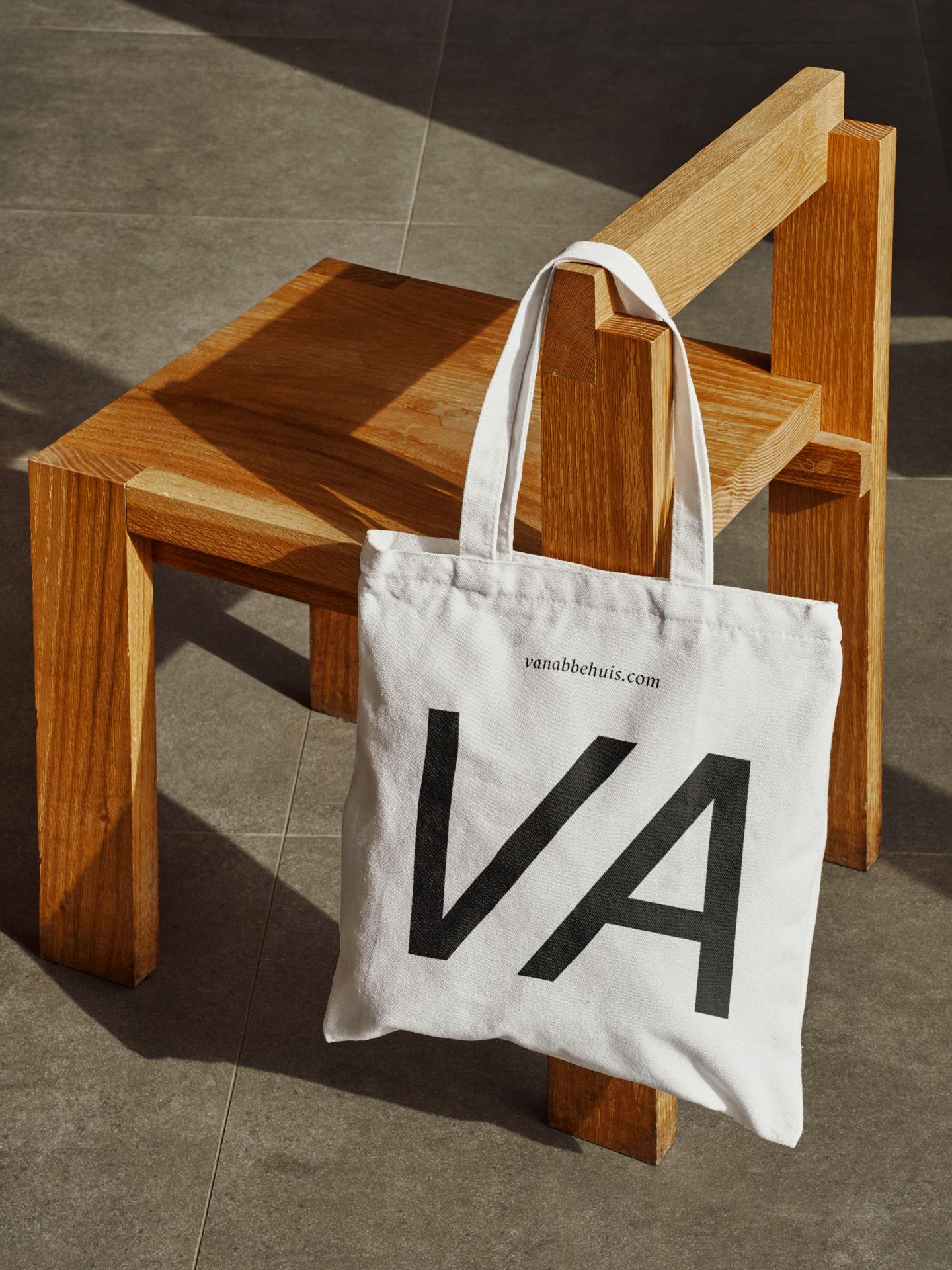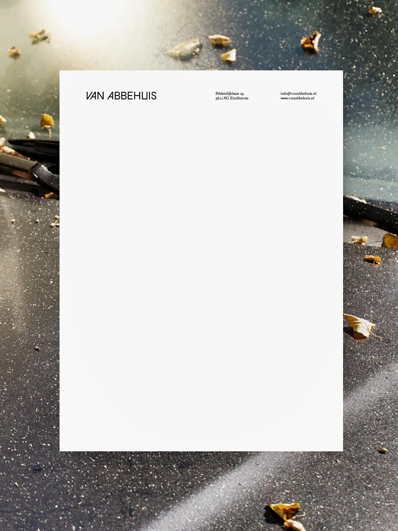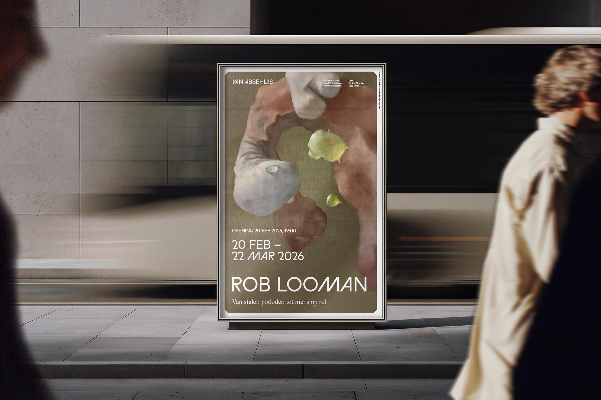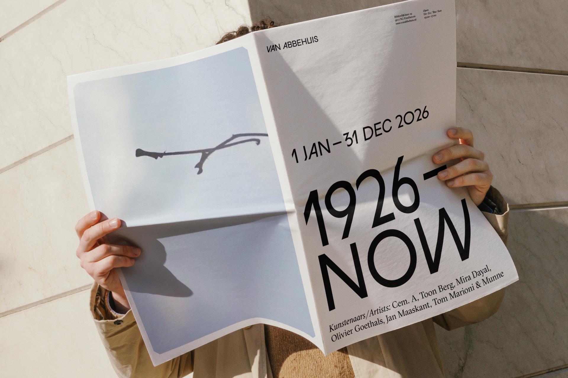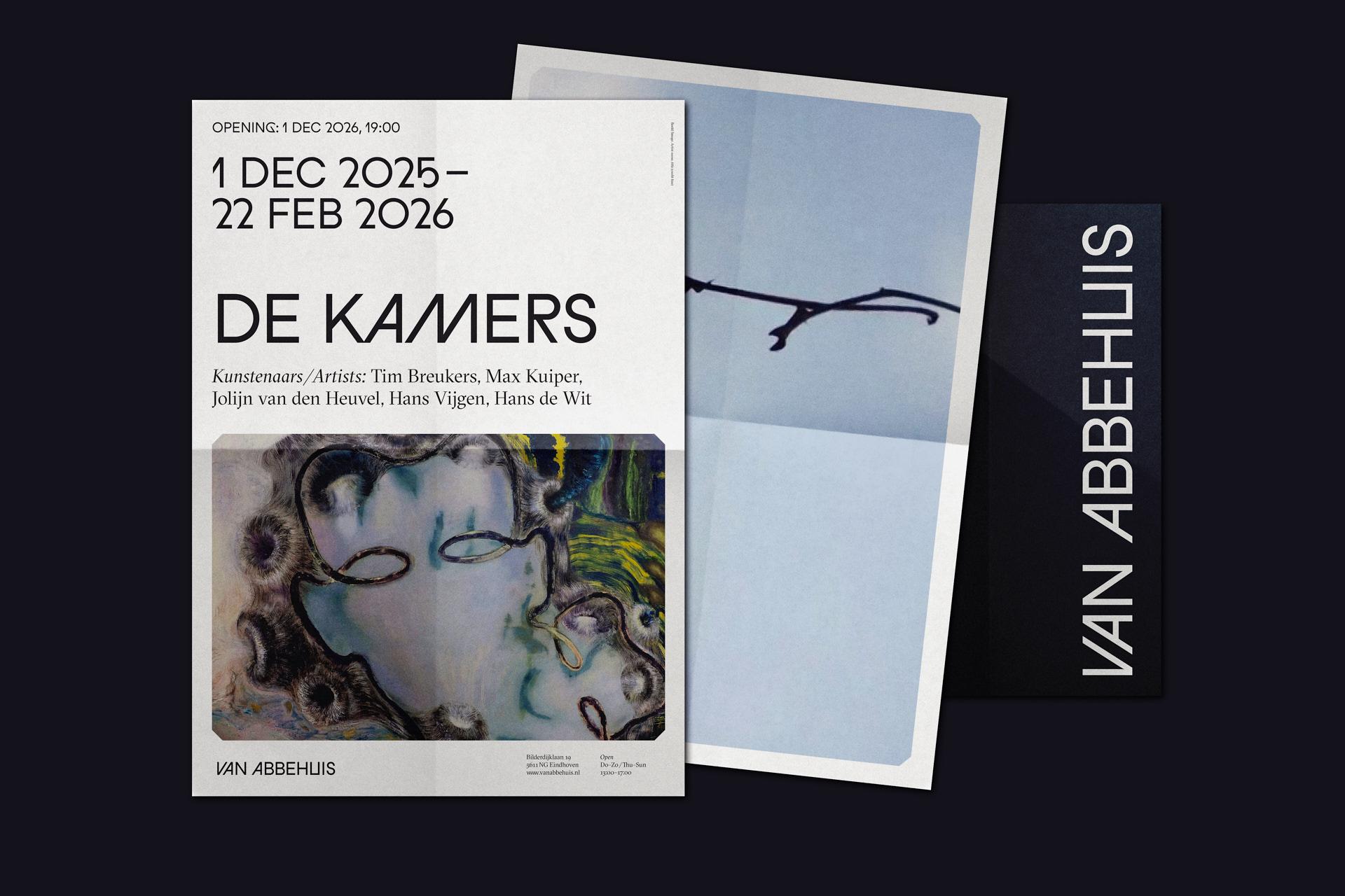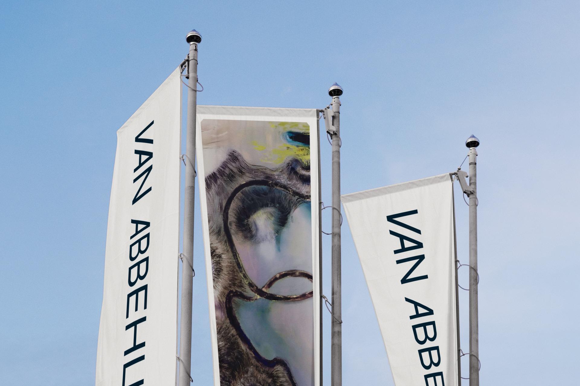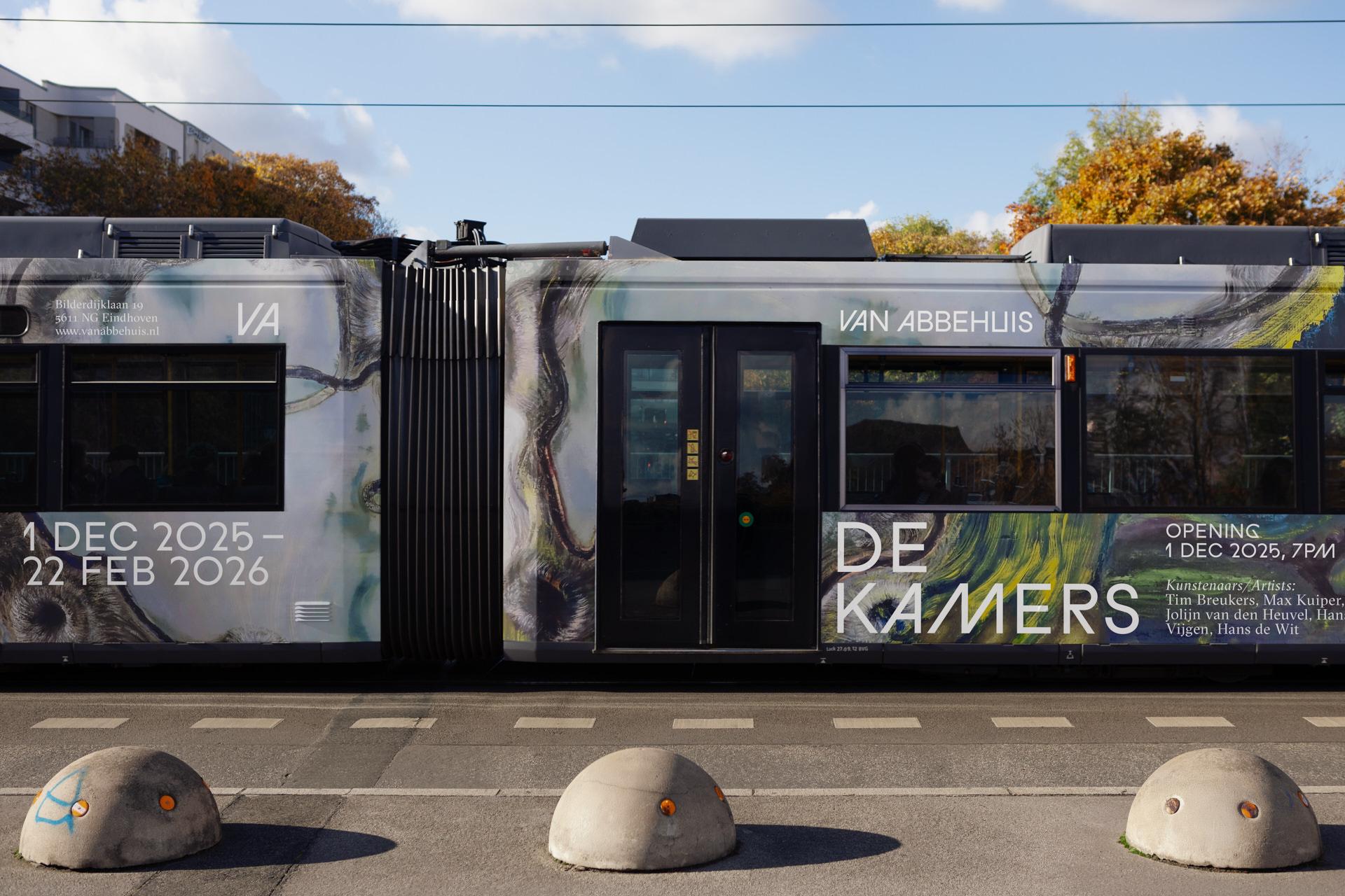



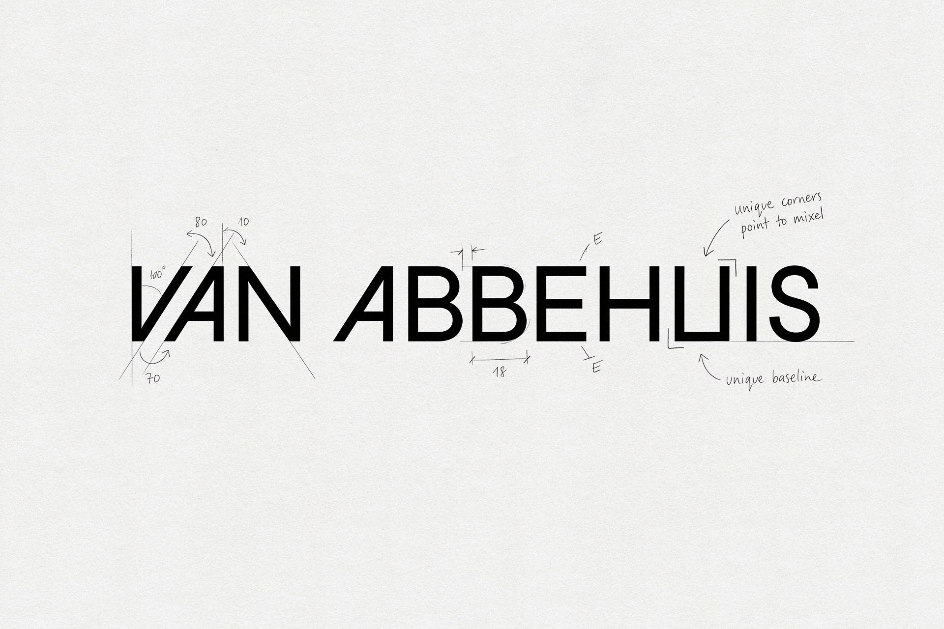
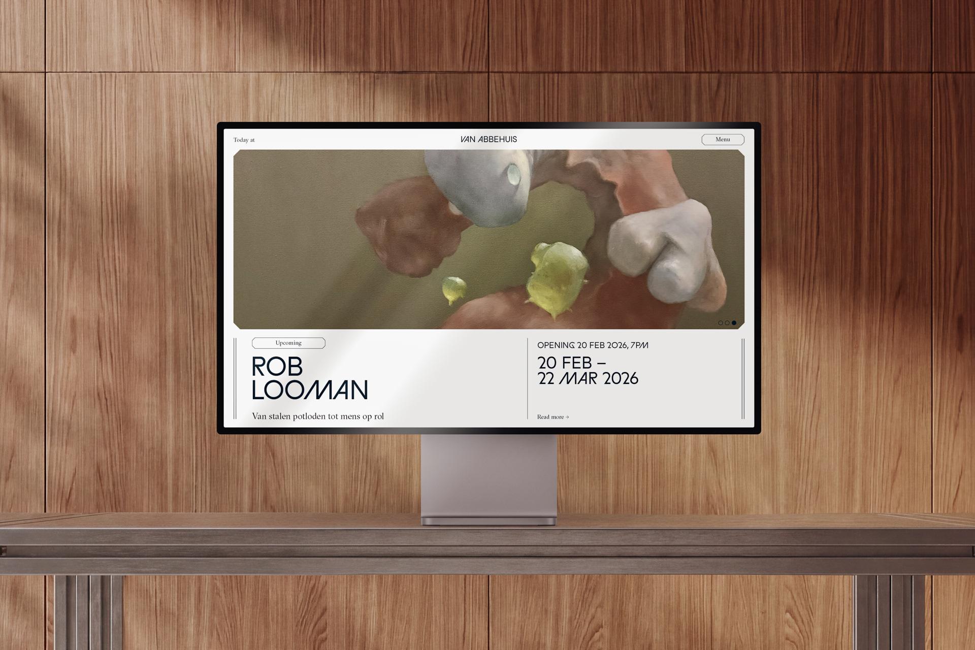
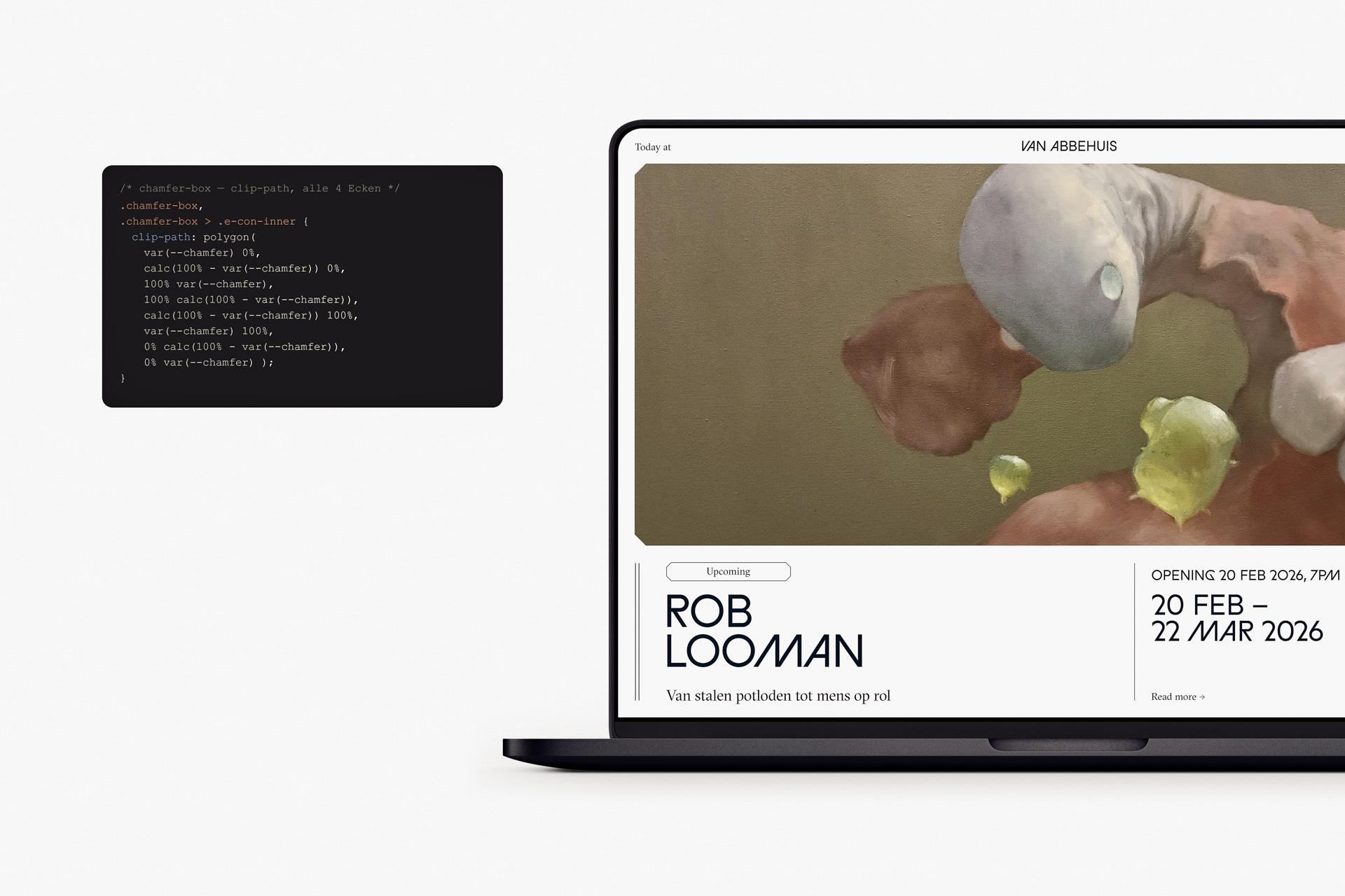
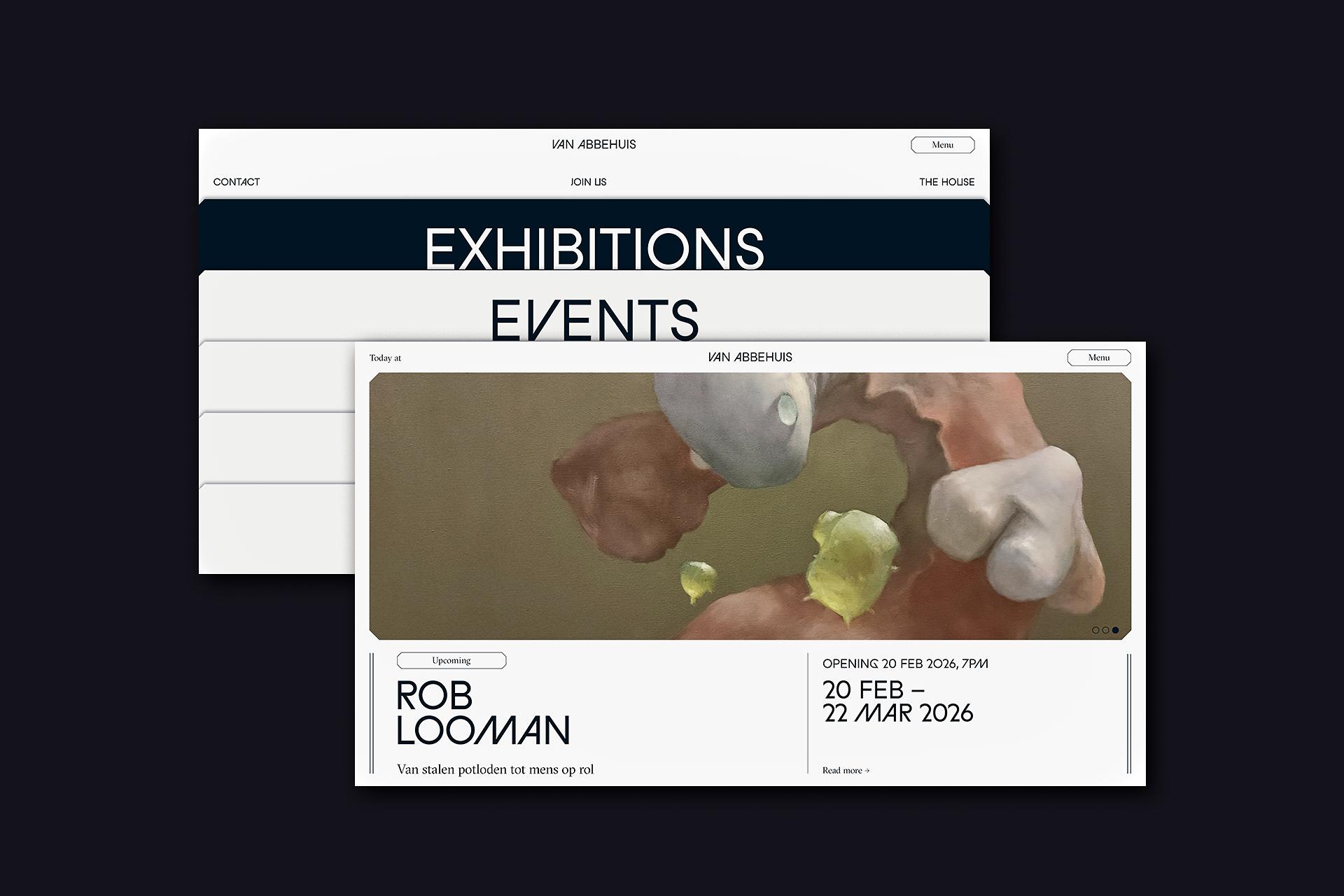
Van Abbehuis — is a museum brand built around its exhibition programme. I designed the identity and a typographic, editorial site that puts current and upcoming shows front and centre, and built it as a live product.
Service
Branding, UX/UI design and front-end development
Team
Site
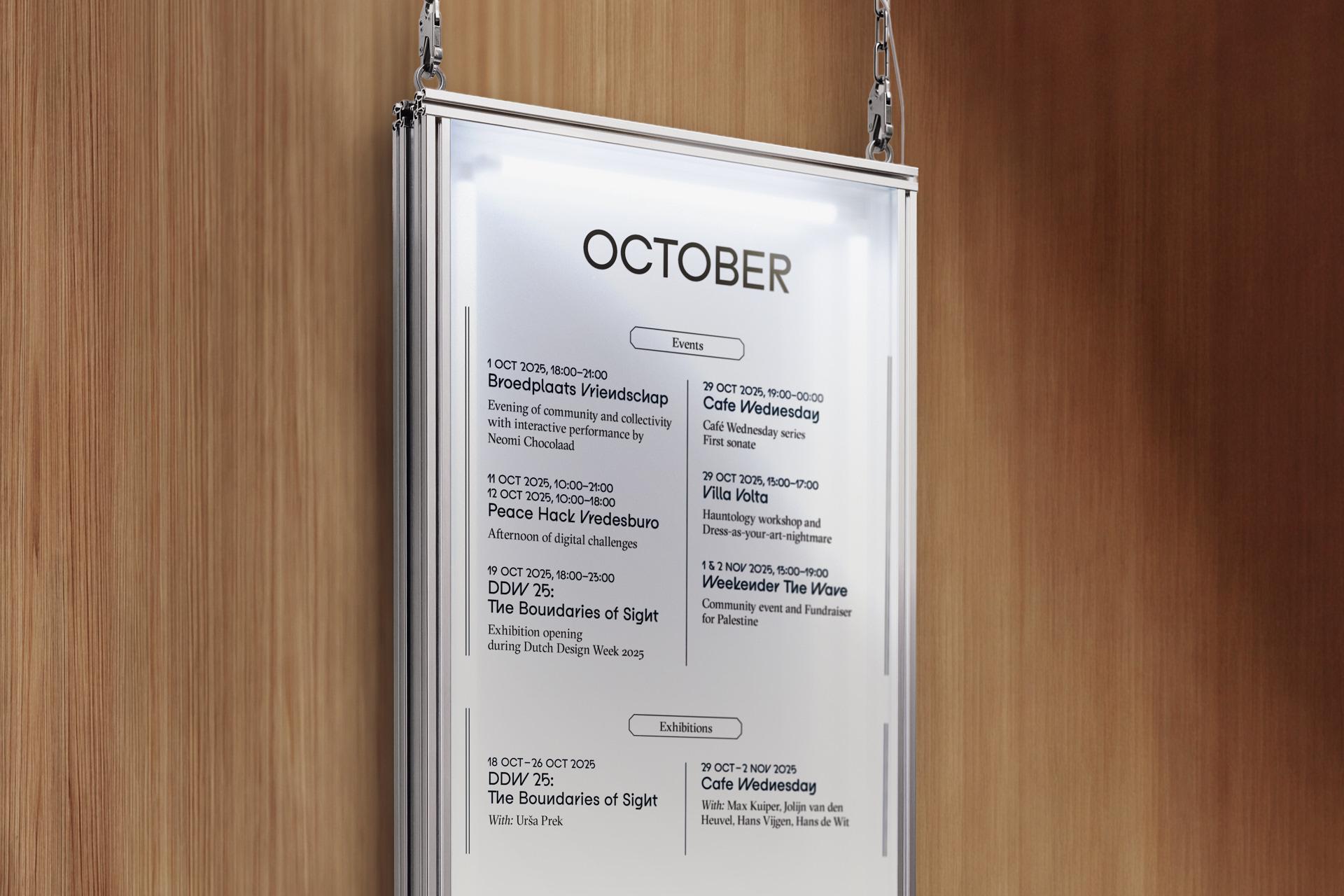
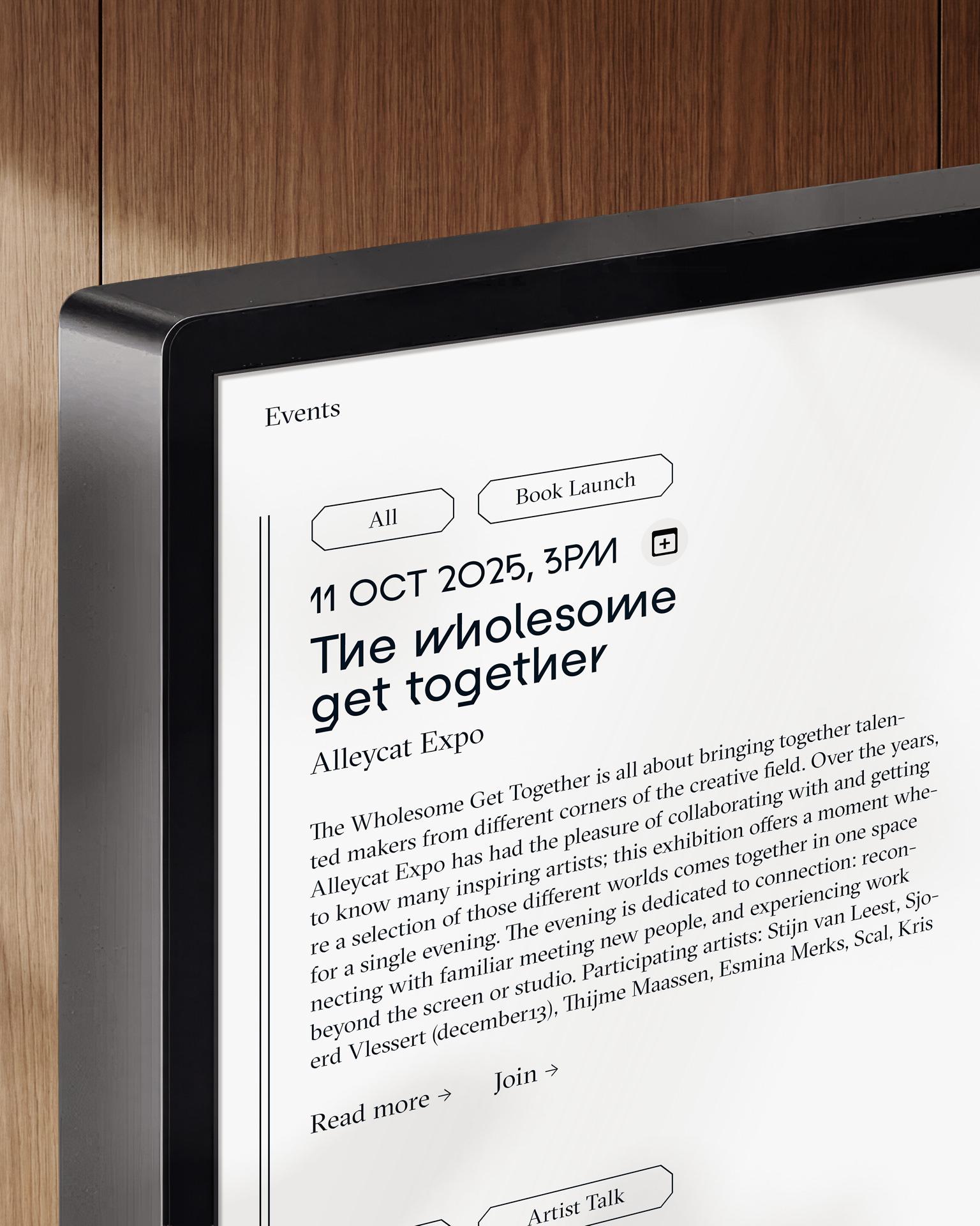
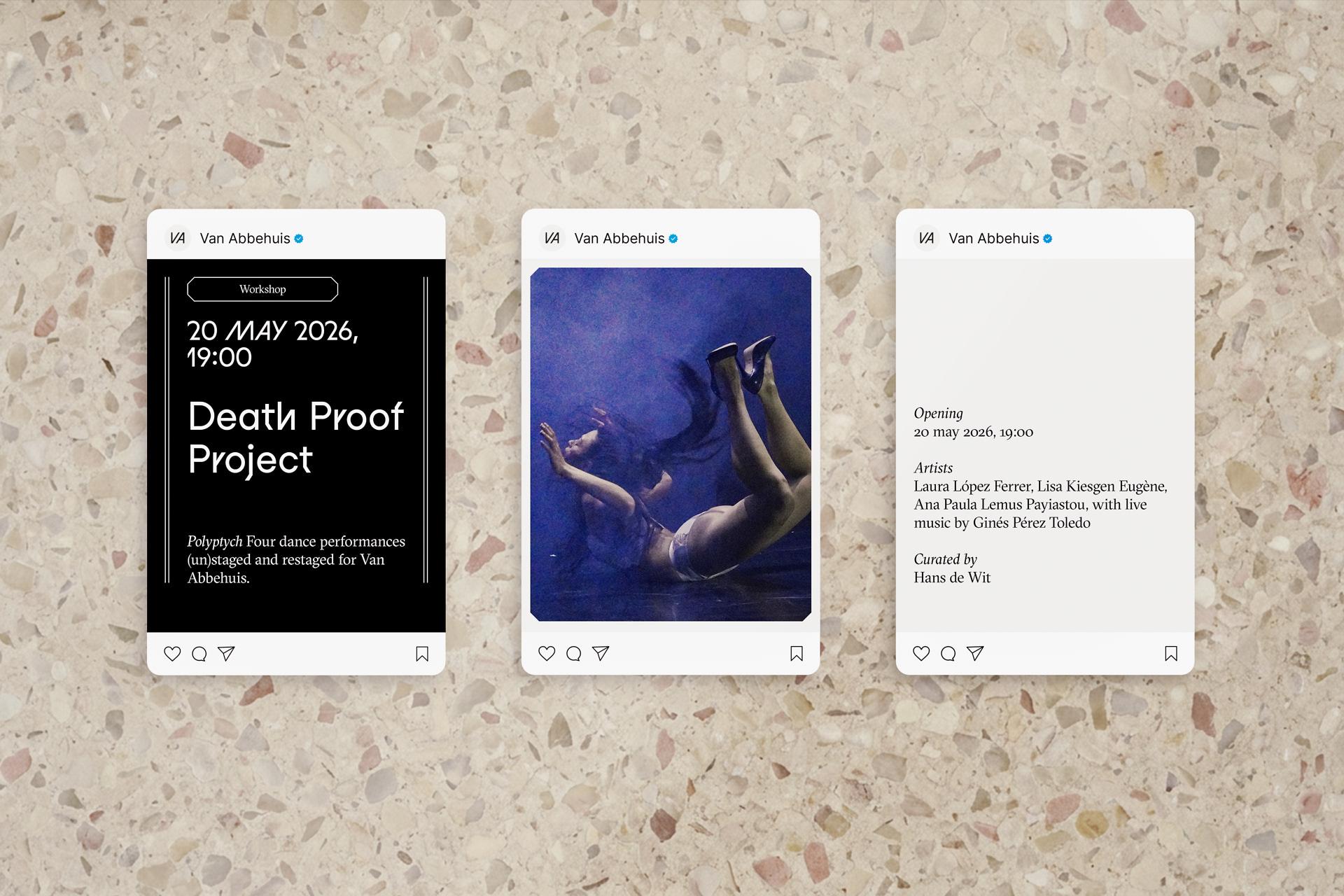
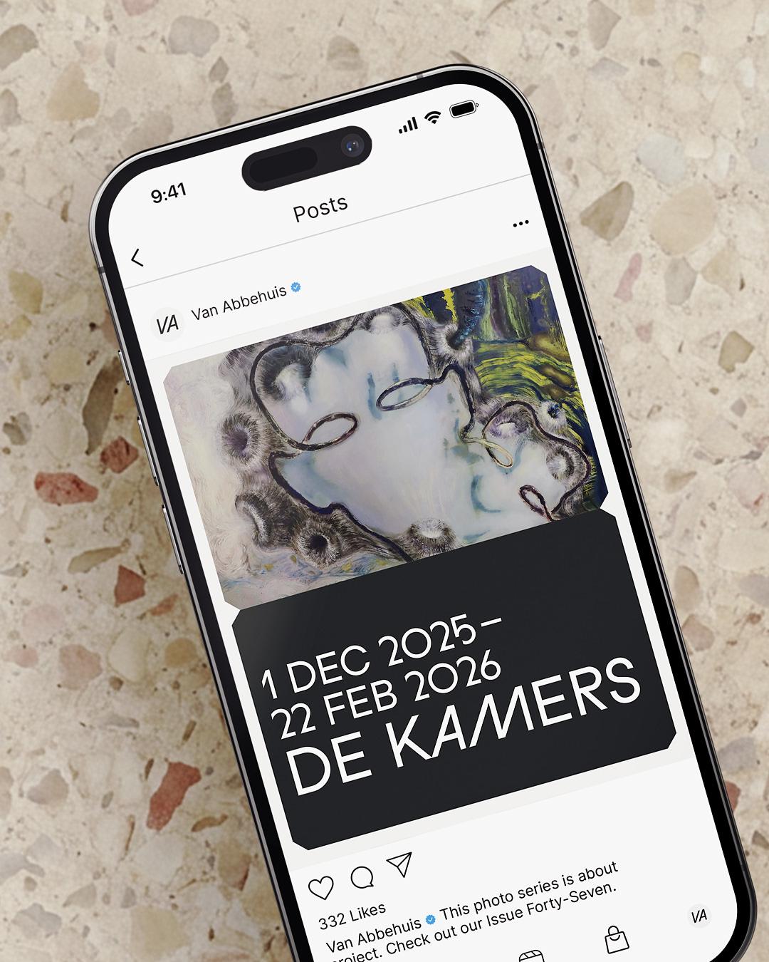
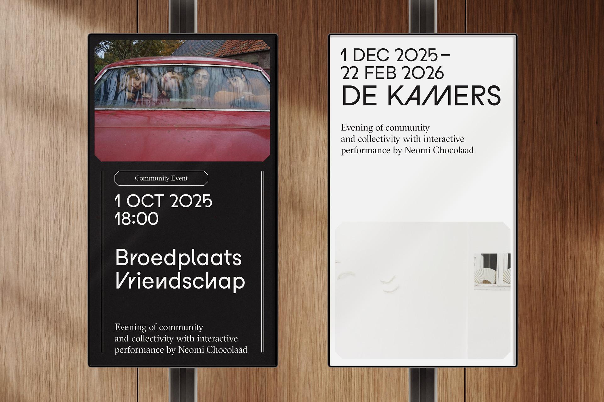
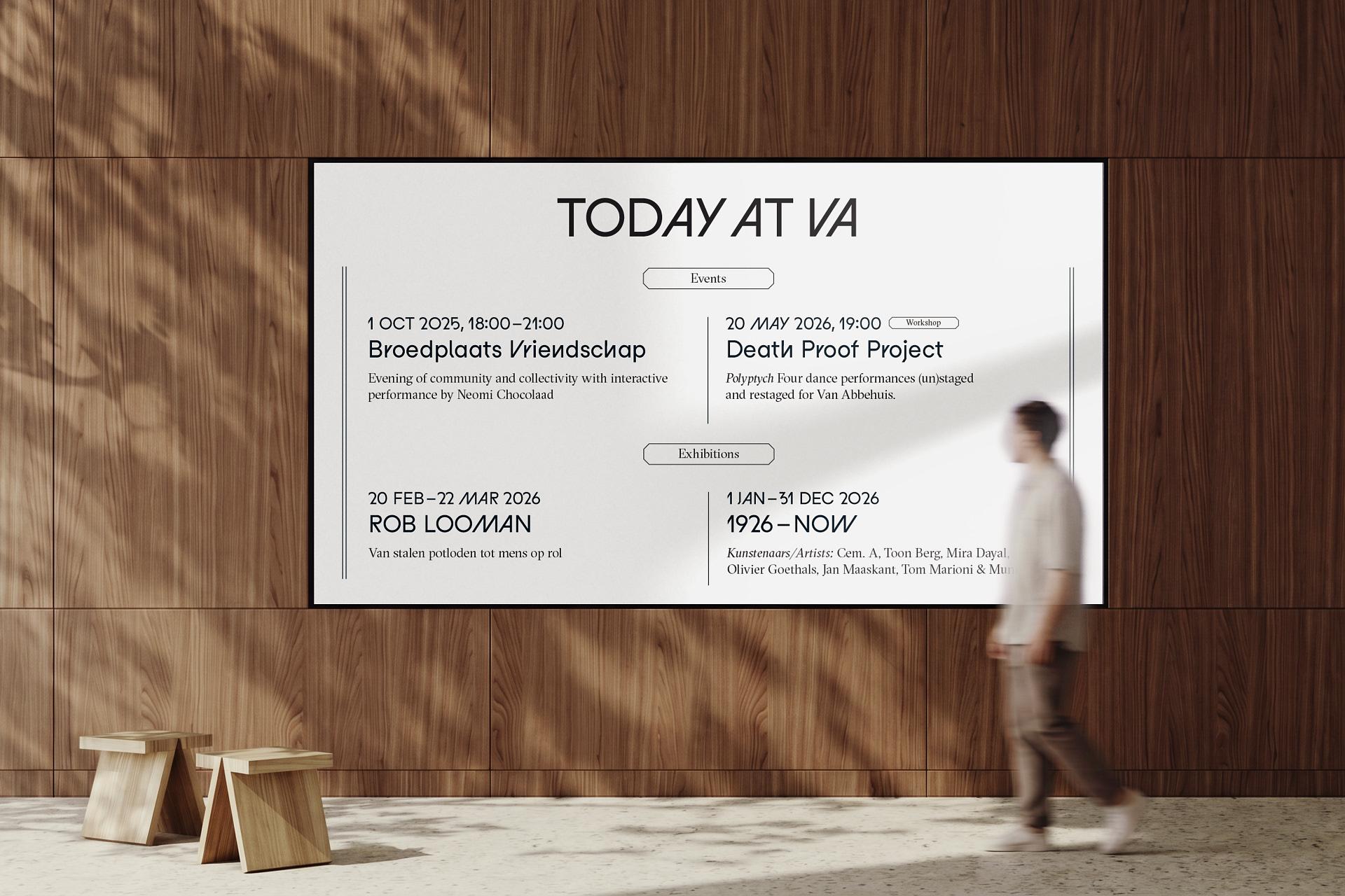
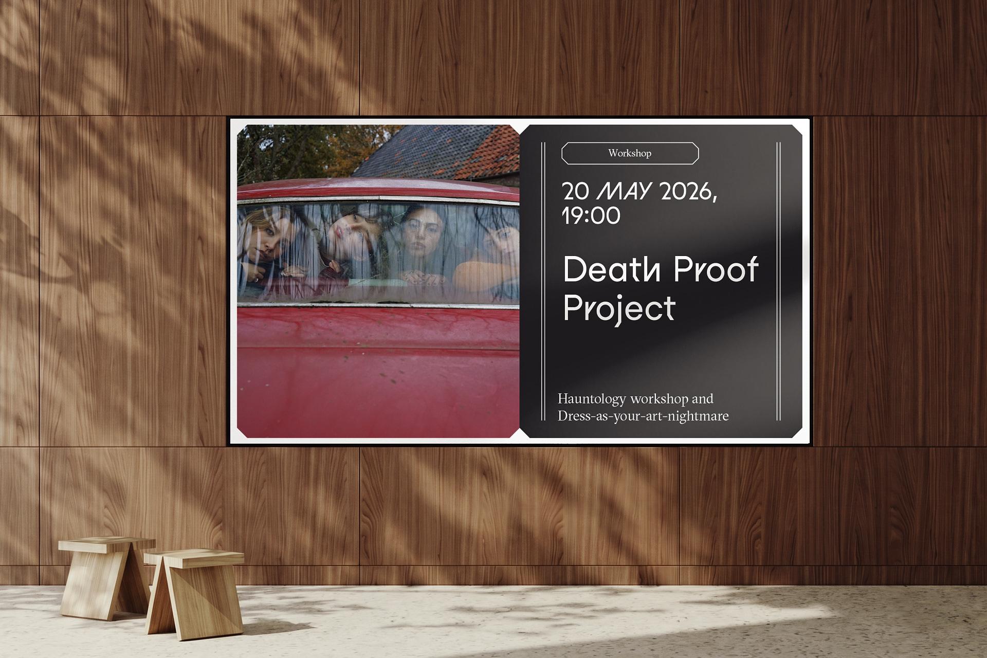
Down to the Corners
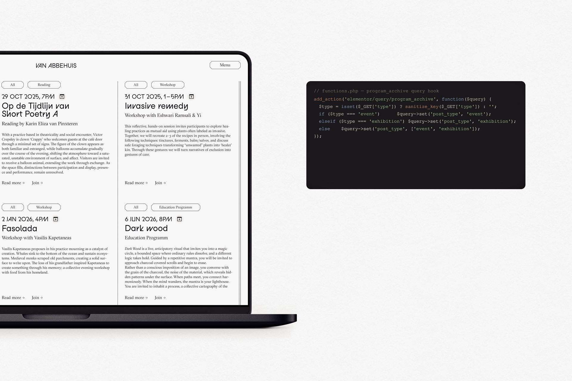
The character lives in the details, the same way it does in the house itself, in the latticework, the stained glass, the crackle floors that made it through a century. I answered that with a chamfered geometry running through the whole interface. Cut corners that echo the architecture and give every panel real weight instead of the usual soft rectangles. GT Sectra, set and spaced by hand for a proper editorial voice. And underneath it all a custom filtering system, so a programme that keeps growing stays easy to move through. Nothing off the shelf. Every part made to measure, in a building that was too.
Once a year, Berlin Design Week turns the German capital into a platform for innovative design. The multifaceted program includes formats such as exhibitions, showrooms, talks, films and workshops, which are held over seven days in parallel at many different locations in the city. Designers, museums, cultural institutions, galleries, studios, project spaces and companies present new approaches and currents within contemporary design. Service Art Direction Campaign, Branding Refinement, Web Design, Advertisments